Make your users’ mobile experience your number one priority.
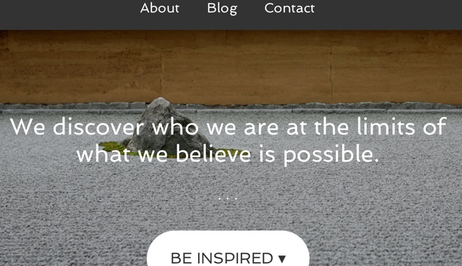
Unless you’re reading this post as an email you’re probably aware that my site has a new look and feel.
I’ve been meaning to make the change for some time but it was a comment from ex-student and current Facebook friend Rhys Moult that spurred me to action.
On a link to a blog post he asked when I was going to make the site responsive. He was telling me that he was reading my posts on his smartphone and the experience was crap. In other words, the page he was viewing scaled down so that the whole thing fitted into a tiny screen.
The problem with that is the text becomes so small that it’s difficult to read without either spreading the page with finger and thumb or turning the phone on its side so that the text grows in height as it spreads in width. Either of these two options are a pain in the you-know-where.
Based on this I tackled the task of the site redesign changing the theme of the site. (That’s the beauty of using WordPress – there are heaps of really cool premium themes to choose from without the need to shell out on a designer.)
There were two major contenders for the theme.
Before I tackled the task of choosing the theme I created a list of my must-haves for the site. I wanted the new look to be clean and smooth have and have an uncluttered feel. But most important of all I wanted it to be responsive.
In other words, I wanted the site to display something visually stunning on a big screen and then change shape as the screen size changed. On a 27′ iMac I wanted the site to have an open look with a sidebar on all pages except the landing page. On an iPhone I wanted the sidebar to disappear to below the main content.
And of course I wanted that responsive design to deliver my friend with text that was easy to read when viewed on a smartphone.
I started the hunt.
This site was previously built using a Pagelines theme. They’re pretty good. Revo by Aleksander Hansson was my first choice because it was bold and had these really cool paralax effects.
Then I found AgencyPro by Genesis. It, too, had a striking design, was built responsive out of the box and allowed some cool customisations. As I’d used Genesis before that’s the one that got the nod.
About 12 hours later my new look site was published.
What’s different?
If you’re reading this on your desktop pick up your smartphone and browse to the site. Tilt the phone on its side and watch the site change shape again. If you’ve got an iPad nearby give that a go in both landscape and portrait mode. Each will give you a slightly different experience.
Notice how the photos don’t get too small so that you can’t see them. On really big screens, like my iMac, the background picture ‘grows’ so that it doesn’t pixelate.
If you’re thinking this all sounds a bit of a self-indulgent brag, you’re right – to an extent. I am proud of how the site looks. But that’s where it ends.
The point of this story is that responsive design is here to stay. If you own a business and your site and your email marketing aren’t designed on responsive principles you’re leaving money on the table.
Why?
Because people today expect better. They don’t want to be forced to pinch and pleat and spread just to find out basic information about your products or services. They want that information now or they’ll go somewhere else.
The other point to this story, especially for real estate agents, is to not let your web designer tell you that you need a mobile site. The site that you’re looking at isn’t two sites. It’s one site that behaves differently depending on the device you’re using.
That takes a little bit of upskilling on the part of web developers.
A web development firm has designers and coders.
The designers can no longer just create a desktop version of your site design. They’ve now got to design it for different screen sizes and resolutions. That takes extra work and an understanding of the way the new web works.
The coders need to learn some new tricks and add to their coding vocab.
For example, I recently hired someone to code a responsive email.
“I want a responsive email template,” I said.
“Nope, can’t be done,” they said.
“Umm, yes it can,” I said.
“But we’ve tried and it doesn’t work,” they said.
“Try again,” I responded.
Guess what. They did it. Not perfectly but they did it. If I’d given up after their first rebuttal my email marketing would look like everyone else’s – crap on a smartphone.
For me, the future of online is responsive. Of course there are a few exceptions to this ‘rule’ but in the main if a web developer can’t/won’t/doesn’t know how to build responsive, I’ll go somewhere else.
The lessons? If you rely on your website to market yourself:
- Design for mobile first.
- Design for mobile second.
- Design for desktop last.