[tweetmeme]
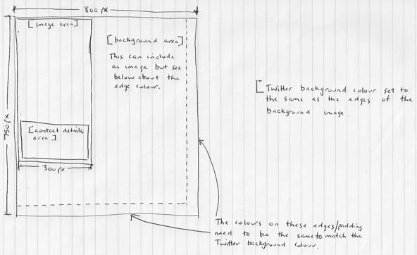
Here’s how I layout a Twitter background. It gives displays well on smaller screen sizes while the using Twitter’s background color to make the image look bigger on larger screens.
I should point out that the [background area] will be, in the main hidden behind the Twitter feed area so don’t put anything important in there. Keep the important stuff inside the [image area].

